Jun Kit was recommended to me by a friend who saw my call out for artists on social media.
I checked out his portfolio and liked the impressionistic feel of his art. I particularly liked his logo designs – I had come across the Queer Lapis design before and thought it very clever. It was only then that I knew Jun Kit was the artist. Incidentally, he was also commissioned to the LoyarBurok Training logo design, which I liked too.
Jun Kit’s pieces are thoughtful and his art has a casual impressionistic vibe to them.
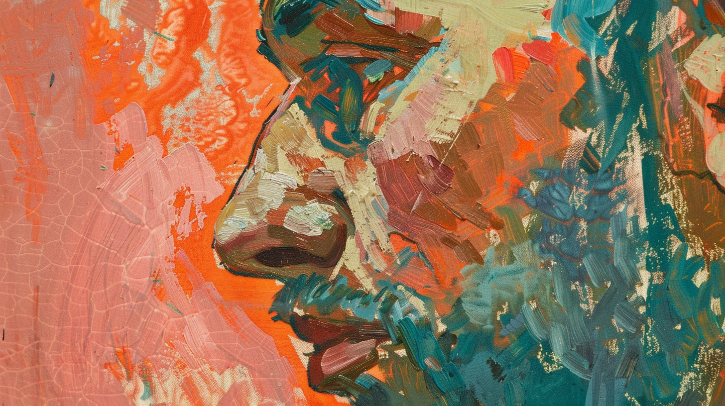
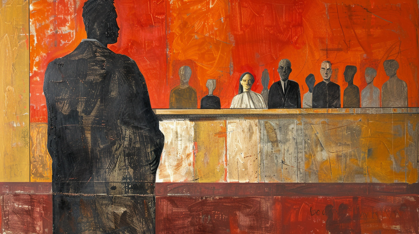
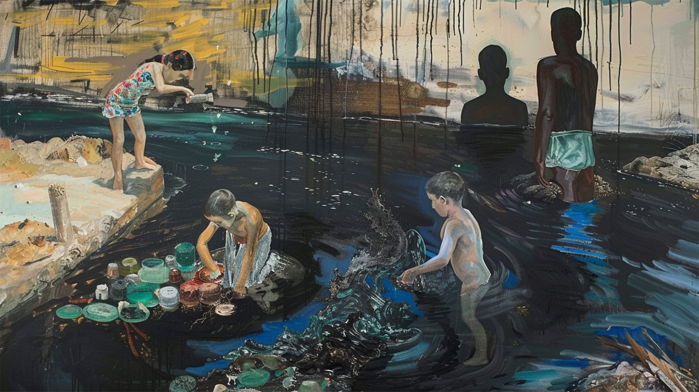
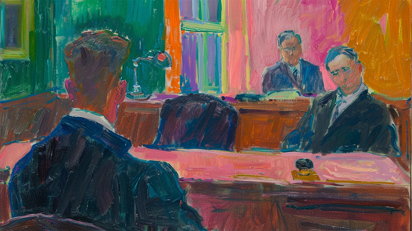
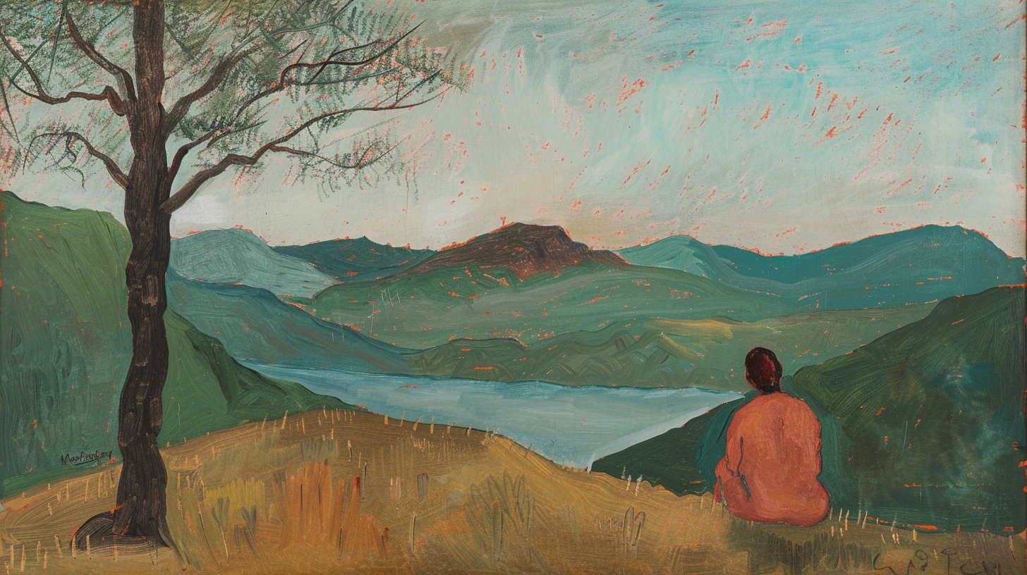
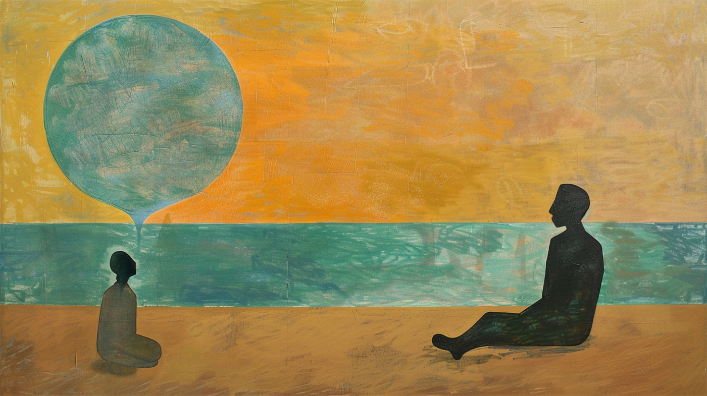
For this piece, he gave me 4 options to work with. You can check out those options below:
My initial order of preference was Option 1, Option 4, Option 3, and Option 2. However, I felt Option 1 was rather conventional and reminiscent of the Not Risking Death piece.
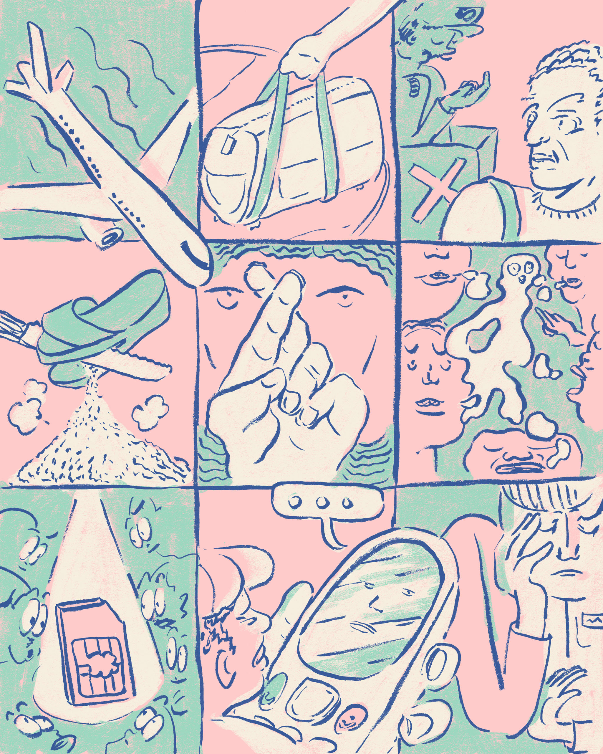
I finally went with the paneled option for three reasons. It was unusual, I love comics and thought it would be cool to have a panel of images like a comic book. None of the commissioned artists had proposed it yet.
I am very pleased with the finished piece in Jun Kit’s inimitable style.
Related Posts
- Not Risking Death | From the Atelier
From the Atelier I commissioned Hanis Nadzir for this and two others. She was introduced…
- Sit near the staff | From the Atelier
From The Atelier Gerald Chong was commissioned for this piece after he saw my call…
- First Impressions Are Something | From the Atelier
From the Atelier Emily Wee was commissioned for this piece and another. Emily was a…
- Ask the right source | From the Atelier
From the Atelier Razie Alfiedan was commissioned for this piece. He wrote in after he…
- Branding and Reputation | From the Atelier
I commissioned Emily Wee for this piece. I did a short write-up about Emily here…
1 thought on “Right up to the hilt | From the Atelier”