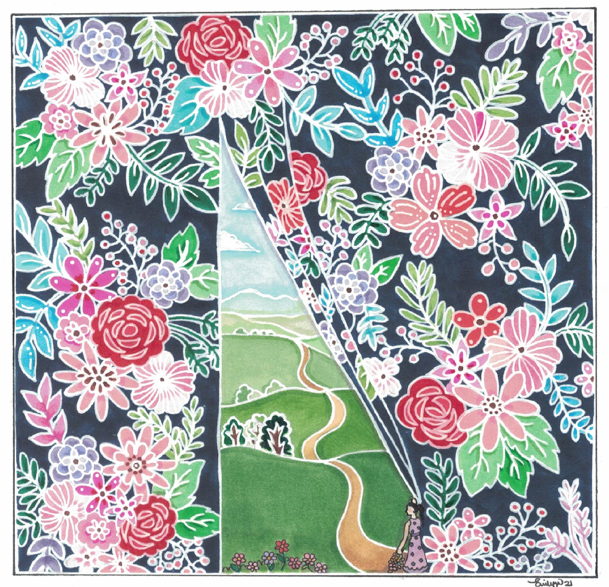
I commissioned Emily Wee for this piece. I did a short write-up about Emily here where I feature her other piece for me. You will find her portfolio and contact there too.
This was a difficult one for me to conceive visually. I thought Emily appropriate because of her corporate background. I figured she knew all about the spin and sell. She could grasp the thrust of my theme.
I am terribly pleased with Emily’s piece. I think she captured and complemented my essay’s theme beautifully.
I love how Emily’s contrast of beauty reflects the contrast between branding and reputation. To Emily, though both have a beauty about them; but they differ significantly from each other. One, has a bright, colourful and eye catching immediacy to it whereas the other has a gentler, warmer and more lasting sense about it. Her use of the path narrowing and fading into the distance reflects the journey of establishing a reputation compared to branding’s shock of flowers which have no stems and darkens its colleagues and competitors until they are no longer visible.
Related Posts
- First Impressions Are Something | From the Atelier
From the Atelier Emily Wee was commissioned for this piece and another. Emily was a…
- Branding and Reputation
Branding and reputation are different ways of making ourselves known to others; the difference between…
- Not Risking Death | From the Atelier
From the Atelier I commissioned Hanis Nadzir for this and two others. She was introduced…
- Sit near the staff | From the Atelier
From The Atelier Gerald Chong was commissioned for this piece after he saw my call…
- The Occult in Legal Practice | From the Atelier
From the Atelier Because I liked Hanis Nadzir's dramatic movie posters style, I thought she…